Tuesday 11 November 2008
Tuesday 4 November 2008
Chamber Punk
http://www.myspace.com/bonfiremadigan
Found a comment by them on the myspace for a zine I sometimes buy about female artists. Haven't thought about them in years. I'll have to buy a CD.
Thinking of going adventuring to Ladyfest Manchester this weekend... Zombina & The Skeletones, The Slits, Vile Vile Creatures, Miss The Occupier, Awesome Wells... somebody pinch me!
Stand by for my Disorganizised poster in the (vague) style of Alphonse Mucha, the finished Conscripts demo sleeves, press stuff and mock-ups for marketing events/website, and a mini-project about make-up branding.
Volunteering at Plus+ on Friday and then I might run away to Manchester, depending on financial and work constraints.
Saturday 1 November 2008

London cancelled!
Have been doing some reading about branding and feeling pretty lazy. Went to a halloween gig for The Sin Kings dressed as...something half dead. We were then driven home by an apparently psychotic taxi driver. I fulfilled a private hero-fantasy of mine and got the chance to ask a big issue seller if she had somewhere warm to stay, without it being awkward or dangerous or embarrassing as I know her relatively well. She did, so the rest of the hero-fantasy was unnecessary.
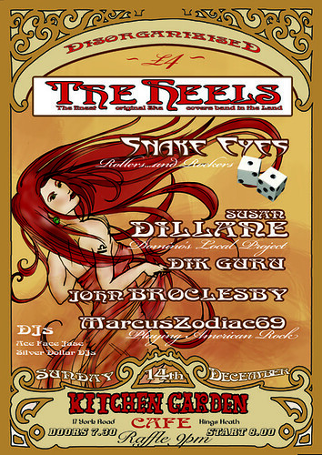
Got another poster commission to be getting on with soon, for a music/spoken word event at the Kitchen Garden Cafe.
I'm really enjoying this book on branding by Matthew Healey. Seems sick, doesn't it? I've spent years ranting at television advertising though, and hence have a heightened interest in the backstage workings of product advertising and positioning, and a pseudo-savvy attitude to consuming. Understanding how to construct a brand implements the right and left sides of my brain - both very active and quite separate - and also, it occurred to me today, allows me to feel that I am taking control of that blaring box and those messages and images which bombard me day after day. I can shake my fist at the tv and say, I RULE YOU!!
I'm learning a lot and banishing a lot of naivete in an area which I've had a vested interest for a long time - the messages that advertising is trying to drum into me and the world, its motives and how it all works. And also, learning a process and a profession which involves problem-solving, meeting peoples' specific needs, working across a wide variety of media and themes, and nurturing the difficult beasty of Creativity. And that's very satisfying.
Friday 31 October 2008
At the moment I'm finalizing designs for the Conscripts' demo/press packs and masterminding marketing/publicity activities which involve rallying followers through interaction and involvement.
Reading up on branding, and really must start making notes for my dissertation.
I'm undertaking some branding exercises which focus on taking a seed of truth... and nurturing it. I'll also be experimenting with visual language and tone by producing a series of flyers.
Got some lovely books recently; Visceral Pleasures by Vaughan Oliver (I do so love the Doolittle artwork...I used the demo sleeve years ago for my GCSE sketchbook...here I am again! I really must buy the album as it got misplaced) - Designed by Peter Saville and a few bits on branding/semiotics.
I have to get into town and post my Type Tart Card before the deadline.
This weekend, however, I am paying a much-anticipated visit to London to see my close friend Fyzal Boulifa, up-and-coming writer and director of sumptuously bleak short films
I'll be helping at the Plus Festival on Thursday and am back in Leamington Spa teaching Photoshop to the 15-18 year old massive on Wednesday.
Monday 20 October 2008


My entry for the Type Tart Cards competition....
As usual, Flickr has made the colours go a bit funny!
(probably my fault for using the wrong palette actually).
Saturday 4 October 2008
Thursday 2 October 2008
Photos from The Conscripts photoshoot
A few photos....my camera isn't too great and keeps uploading pictures in a low res for some reason :(
The band wanted photographs in a wrecked room, a la trainspotting...I'd just moved house and had a mostly empty flat. So I went to my old house and got loads of bags of recycling bottles and rubbish and trashed my new lounge with 2 years' worth of wine bottles that never got put out for recycling.
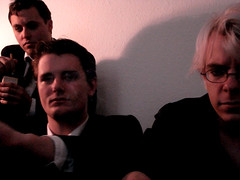
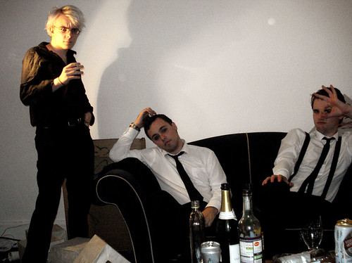
(uploading to Flickr seems to have affected the quality slightly)
Sunday 21 September 2008

Tuesday 16 September 2008
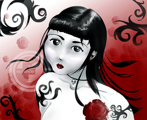
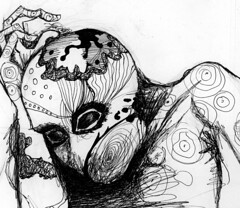
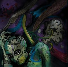
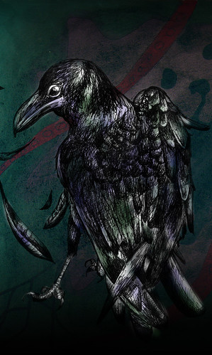
Decided I should do some personal artwork in Photoshop as it's been a long time. This is a drawing I did a while ago. My photoshop knowledge has increased considerably just recently, particularly as I've been researching to teach it, and as a result my style seems quite different now, I finished this very quickly, it doesn't look amazing but I'm pleased I finished it in an evening.
I was naughty here and used a built-in Photoshop rose brush...but it's surprisingly nice!
Saturday 13 September 2008
Friday 12 September 2008
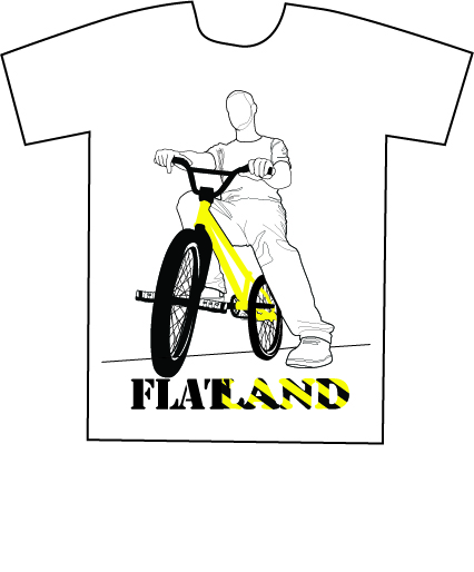
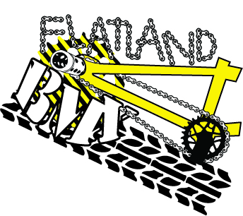
Doing some t-shirt designs for Hybrid Arts' 'Extraordinary Cycles' event, to do with Flatland BMX...stuff. Here's one idea.
My work seems to be quite clinical lately. I don't know whether I should loosen it up a bit and add some hand-illustration.

BUT looky, I made a bike chain brush! ^_^ Haven't decided what to do with it yet, hence the shapeless curve...
My work seems to be quite clinical lately. I don't know whether I should loosen it up a bit and add some hand-illustration.
BUT looky, I made a bike chain brush! ^_^ Haven't decided what to do with it yet, hence the shapeless curve...
I've just done some work for Karen at Kaos-Arts.com - I was recommended to her by someone from my work placement in Digbeth last year. Which is pretty cool.
I just traced some park signage into illustrator which she created with some children.
Bit of a learning curve in terms of working in Illustrator while someone's watching!
I had taken on WAY too much work that week and was falling apart a bit, so my first externally-referred freelance project was nearly a bit of a disaster, but in the end things were OK.
http://www.kaos-arts.com
Wednesday 10 September 2008
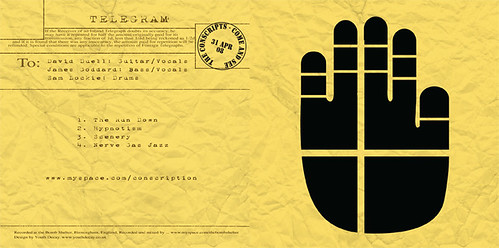
I've managed to convince my friends The Conscripts to let me do various things for them in terms of design, including working on their logo and designing their demo sleeve. Yay!
Formerly Fade To Sepia, they're a very dedicated and serious band, sounding kind of like The Fall, Joy Division, etc. Particularly in their 1st and 2nd world war-related affectations.
So I've got the likes of Factory Records to have a look at.
Dave of The Conscripts showed me a logo he had drafted together, the silhouette of a hand with a cross through it, and said that he wanted it 'stark'.
Here are my current drafts which are more or less done I think.

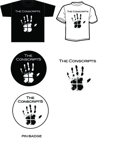
The demo sleeve is going to be a war artifact.... you'll have to wait and see!
Formerly Fade To Sepia, they're a very dedicated and serious band, sounding kind of like The Fall, Joy Division, etc. Particularly in their 1st and 2nd world war-related affectations.
So I've got the likes of Factory Records to have a look at.
Dave of The Conscripts showed me a logo he had drafted together, the silhouette of a hand with a cross through it, and said that he wanted it 'stark'.
Here are my current drafts which are more or less done I think.
The demo sleeve is going to be a war artifact.... you'll have to wait and see!
I met a girl at a party recently, she saw these pictures which I took of my friend Abi and gave to her as a gift, and asked me to take some of her.
My camera isn't that good, I'm not a photographer and my Flash kit is a bit dim.
But I do like to have a go! And Photoshop can theoretically fix all ills.
I think I may have overdone that a bit.... I accidentally took all of the photos at 72 dpi though and had to do a bit of airbrushing!!
Here are a few of the 13 or so that made the final cut.
Sunday 10 August 2008
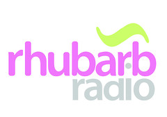
A very quick attempt at designing a logo for Rhubarb Radio in an attempt to ingratiate myself with Birmingham/Moseley. I didn't have a great deal of spare time and since there were design companies involved I didn't submit any more ideas.
I guess this was more of a swift exercise in typography and copycatism than a final design.
Overcompensating for my first design I think, which was based on a rhubarb and custard sweetie and, being hand-rendered to start with, looked like some sort of 70's hippiewagon daubing.
Sunday 27 July 2008
Saturday 26 July 2008
Just getting the hang of using type...
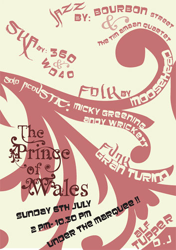
Flyer for the Prince of Wales.
The Prince of Wales is a very traditional pub in terms of its interior, but obviously for an event like this, and in order to stay in profit they would like to attract a young crowd. So I wanted to create something a bit funky to compete with the newer, refurbished, trendier pubs that are in abundance around Moseley, without trying to deny The Prince's unique traditional character.
In order to do this, I took some photographs of some of the lovely patterns inside the pub - wrought iron on the stools, gilt on the mirrors, etc - and traced it into a vector pattern. I took this one from an old piano that sits in the bar.
I tried to match the colours with the pub's interior too - next time however I'll try to take into account print colour (although it's difficult when they're using an inkjet). I thought the typographic nature of the poster would bring it up to date in spite of the wine colour scheme.
The fonts are a nice chunky one I found on my boyfriend's computer, and something that is actually a graffiti/tagging font, which seems to work well. It mirrors some of the shapes in the more sensible font which means it doesn't look out of place, while adding that essential 'young' edge.
I now think that the text is a bit too wimpy and could do with a bit more oomph, to fill up the space a bit more, but I'm quite pleased with it as it was a rather large step for me in terms of using type as form - it was a bit of a 'eureka'! moment.
Is anyone else utterly appalled by the recent spate of anti-aging product advertising?
Brands like Revitalift now appear to have formed an alliance with the global cosmetic surgery industry and adopted slogans like 'until you need a permanent lift... there's Revitalift'.
Obviously they've agreed not to discount or de-value butchery in their advertising, but even to promote it. UNTIL you NEED a permanent lift...
I also remember very clearly when women's magazines, aimed at working-class women, had horror story after horror story about comsmetic surgery going wrong and the horrible injury and bruising it can cause for months afterwards - there is clearly an endless supply of such tales. Yet about 5 years ago they suddenly started printing stories of joy and rebirth.... it changed my life, I'm finally happy with the way I look! Followed swiftly by a full-page advert for some dodgy surgery centre, where they'll re-augment your breasts or stuff them or break your nose and re-build it. Then if it actually makes any improvement to the way you feel about the way you look, obviously your entire life will be transformed.
Aside from the violence of surgery, the lies about transforming your life are even bigger and come with a steeper price than a car or a telephone contract, maybe even a loan.
And whilst anti-aging products work on the same lies, they could at least have taken a superficial stand against surgery. I'd probably hate that almost as much. Like Dove's 'Real Beauty' campaign - 50-year old supermodels and size 14 exercise-freaks with no cellulite and the odd freckle. They actually tried to enter that ad campaign into the awards for charity campaigns in 2006 or something like that. Obviously they got told where to go. Ha!
Also, regarding the recent laundry conditioner ads.... how can 'diamond and lotus flower' be a fragrance ??!?!! Or Ruby or Sapphire?
Friday 25 July 2008
I am specializing in Branding & Identity for my final year. I recently took a short course in business essentials which was quite rewarding, and am trying to read up on brand strategies. It may seem corporate to you - but I rather enjoy problem-solving; if a business or person gives me a word or idea I try to make it happen, it's not just graphic design but it includes graphic design. This has been a rather large concept for me to wrap my little brain around. But I seem to have done it now. I think identity is the nitty-gritty of design. And the rules and planning and drive that I've applied to myself can be applied almost precisely to business. Which is quite useful.
I'm finishing the youth decay website (slowly, particularly as I have no internet connection)... I helped design the new menu for the Prince of Wales. But I only had a day and what I provided was the bare bones, intended to be improved upon by the wine company's in-house design team.... So I used basic fonts, like the awful MS French SCript, to give an idea of contrasting fonts.
When the final menu came in, the fonts had become even more simplified and the first print, designed to be a deep burgundy, had come out in a horrendous shade of salmon. So, I learned, don't underestimate yourself, and don't necessarily trust in-house design teams to be better than you are.
Even if they are in London.
Now I need to think of a really great concept for a portfolio website and build it. And I need to do my CV and start researching my proposal and dissertation.
I want to use a band who are friends of mine as an ongoing branding/identity project ofr the next year, they're called The Conscripts and are very serious and dedicated and good. But I do need to convince them further.
I should be teaching a couple of photoshop classes in August which I'm quite excited about.

Tuesday 1 July 2008

These are draft menu ideas for the Prince. I provided the documents for the in-house design team of the wine company the pub uses. I only had a few hours to come up with the designs (which use gilt patterns from a mirror inside the Prince, with greenery taken from photographs of the front of the pub - the bright green to bring a modern edge to the traditional/classy wine colour).
Because I knew the document would be going to a design team, I used some very basic fonts to give a general idea with the idea that they would then take this forward into something more sophisticated when presented with the final menu. This didn't happen and I learned a valuable lesson about not making presumptions!
Tuesday 10 June 2008
Thursday 8 May 2008
Monday 5 May 2008
Thursday 10 April 2008
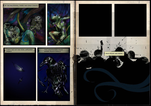
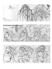
Narrative Sequence
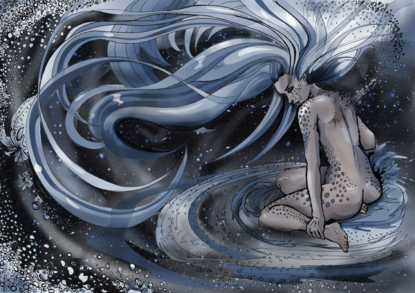
I had my illustration tutorial yesterday, which was quite promising. I've found a style and it dawned on me recently the value of using reference material. I need to carefully choose photographic reference material and render i it in fineliner. I've got a lot of work to do on the layout of my book though and whether I want to do single-page images or lots of narrative panels.... My tutor seems pleased with what I'm doing which is a great relief, as I'm doing mostly graphics modules with one illustration module, and even talking about book submissions. I've got a lot of work to do though and I find drawing really intimidating.
I'm going to have to pick a specialism for next year soon and I'm still doing a bit of everything!
I'm going to have to pick a specialism for next year soon and I'm still doing a bit of everything!
Tuesday 8 April 2008
Sunday 23 March 2008
Last year, I was offered a week's work experience at Notion Studio in Digbeth, an associate of BCU.
One of my tasks was to animate some pre-made characters in Flash for use in their Media Talent Bank website. I got an email today to say it has finally gone live...
Someone else designed the characters, I just made them move!
One of my tasks was to animate some pre-made characters in Flash for use in their Media Talent Bank website. I got an email today to say it has finally gone live...
Someone else designed the characters, I just made them move!
Thursday 21 February 2008
New Modules
I still need to re-organize my Science Fiction Book Cover boards and send them off to the D&AD competition. I also need to pick up my grades and speak to the tutor about what to do about entering the competition. Deadline is 20 March.
Got a 2:1 for life drawing, a 2:1 for creative writing, and probably a 2:1 for something else I can't remember. But lots of grades I haven't picked up yet.
I've got a part time job on a Wednesday afternoon, supposedly teaching young people who need an alternative education and are studying music, how to use design software. I think I have bored them so far. Now i have 2 part time jobs.
I've done a business name and logo design for my mum's Training/Life Coaching business and am building a website. Might have to leave that to one side for a while.
Modules for the next 12 weeks:
Narrative Sequence. (Illustration)
Mostly based on Children's Books, but I will be doing an adult graphic novel probably. Need a plot and a concept.
Have to have a few double page spreads ready. Popped into waterstones to see what graphic novels are selling. Some of them have some narrative text as well as speech and images which is reassuring.
Creating a Visual Identity. (Graphic Design)
We are in groups and have to form political parties, and later we will be doing branding and identity individually. Somehow my group has come up with British Identity. Compiled a few web pages to look at concerning this, multiculturalism etc, along with the meaning of the british flag etc.
THS
I have chosen 'Representations of sexuality in perfume/toiletries ads' for my presentation.
Notes:
Sexuality according to Wikipedia: 'How people experience and express themselves as sexual beings'.
Books to look at: Foucault, feminist literature. Mythologies.
Stuff to do: Tape perfume/toiletry ads and record my personal reactions. Semiotic analysis - binary opposites. Framing devices, devices to make the ad seem natural or like a 'window onto reality'. Role of the spectator in inserting meaning. Social context and values of suggested reality. Dominant ideology of culture.
Tutor's suggestions: spectrum of gender: homosexuality through to aggressive heterosexuality/female sexuality. Age spectrum.
Individualism and sexuality.
Values.
Target audience - often very specialist for perfume ads.
Youtube: spoof perfume ads?
'intertextuality' - advertising referencing other related texts
(e.g. women underwater with hair floating everywhere??)
Hidden persuasion.
Feminist viewpoints.
Sunday 10 February 2008
Tuesday 22 January 2008
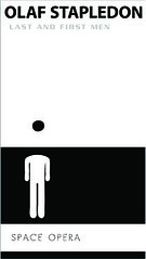
Orion Book DANDAD brief
Foil blocking & stretched out format = shelf appeal
My idea works because I have compressed key ideas and themes from each novel into a symbol which must be decoded. This coupled with the sleek black and white colour scheme, stretched out format and minimal use of foil blocking provides shelf appeal to a wide audience.
My idea works because I have compressed key ideas and themes from each novel into a symbol which must be decoded. This coupled with the sleek black and white colour scheme, stretched out format and minimal use of foil blocking provides shelf appeal to a wide audience.
Monday 14 January 2008
To Do - January 14th
Gra-Fix
Mock up navigation bar ideas - keep simple to leave room for group theme/logo/colour scheme. Structural ideas for website: flowchart
Create example of scrolling newsfeed
Create example of a gra-fix forum with various topics & interactive elements
Gather material for & mock up 2 'design advice' pages in Illustrator/InDesign
Build example of gallery? Research Flickr, look for ways users can upload examples
Design optional animated elements for website
Email ideas to group for clarification
grafix notes

Drop-down/popout menus in HTML - Layers. Menu present on every page on the left, does not change whilst browsing site- subheadings displayed for each section
Scrolling newsfeed on homepage - provides movement, saves space. flash component with link to alternative HTML version (opening in new window) Can make this link to an easily editable text file rather than going through flash - easily update news
How can users upload images to a gallery automatically?
Grafix logo acts as 'home' button
Forum - image uploading here?
Gallery - start with images by the group. Flickr?
Use Flickr?
Link to users' Flickr accounts & display examples
Flickr group?
Redesign site competition - submit mock-up or zipped folder with HTML (email)
black&white - can't go wrong, classic, contrasting, attractive
Use headline
Have plenty of webspace at www.sarahaccident.com. Can link for free through http://grafix.cjb.net or purchase a .com or .co.uk domain for about a tenner
Anchor tags link to other components
Subscribe to:
Posts (Atom)
