Sunday 27 July 2008
Saturday 26 July 2008
Just getting the hang of using type...
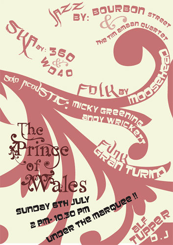
Flyer for the Prince of Wales.
The Prince of Wales is a very traditional pub in terms of its interior, but obviously for an event like this, and in order to stay in profit they would like to attract a young crowd. So I wanted to create something a bit funky to compete with the newer, refurbished, trendier pubs that are in abundance around Moseley, without trying to deny The Prince's unique traditional character.
In order to do this, I took some photographs of some of the lovely patterns inside the pub - wrought iron on the stools, gilt on the mirrors, etc - and traced it into a vector pattern. I took this one from an old piano that sits in the bar.
I tried to match the colours with the pub's interior too - next time however I'll try to take into account print colour (although it's difficult when they're using an inkjet). I thought the typographic nature of the poster would bring it up to date in spite of the wine colour scheme.
The fonts are a nice chunky one I found on my boyfriend's computer, and something that is actually a graffiti/tagging font, which seems to work well. It mirrors some of the shapes in the more sensible font which means it doesn't look out of place, while adding that essential 'young' edge.
I now think that the text is a bit too wimpy and could do with a bit more oomph, to fill up the space a bit more, but I'm quite pleased with it as it was a rather large step for me in terms of using type as form - it was a bit of a 'eureka'! moment.
Is anyone else utterly appalled by the recent spate of anti-aging product advertising?
Brands like Revitalift now appear to have formed an alliance with the global cosmetic surgery industry and adopted slogans like 'until you need a permanent lift... there's Revitalift'.
Obviously they've agreed not to discount or de-value butchery in their advertising, but even to promote it. UNTIL you NEED a permanent lift...
I also remember very clearly when women's magazines, aimed at working-class women, had horror story after horror story about comsmetic surgery going wrong and the horrible injury and bruising it can cause for months afterwards - there is clearly an endless supply of such tales. Yet about 5 years ago they suddenly started printing stories of joy and rebirth.... it changed my life, I'm finally happy with the way I look! Followed swiftly by a full-page advert for some dodgy surgery centre, where they'll re-augment your breasts or stuff them or break your nose and re-build it. Then if it actually makes any improvement to the way you feel about the way you look, obviously your entire life will be transformed.
Aside from the violence of surgery, the lies about transforming your life are even bigger and come with a steeper price than a car or a telephone contract, maybe even a loan.
And whilst anti-aging products work on the same lies, they could at least have taken a superficial stand against surgery. I'd probably hate that almost as much. Like Dove's 'Real Beauty' campaign - 50-year old supermodels and size 14 exercise-freaks with no cellulite and the odd freckle. They actually tried to enter that ad campaign into the awards for charity campaigns in 2006 or something like that. Obviously they got told where to go. Ha!
Also, regarding the recent laundry conditioner ads.... how can 'diamond and lotus flower' be a fragrance ??!?!! Or Ruby or Sapphire?
Friday 25 July 2008
I am specializing in Branding & Identity for my final year. I recently took a short course in business essentials which was quite rewarding, and am trying to read up on brand strategies. It may seem corporate to you - but I rather enjoy problem-solving; if a business or person gives me a word or idea I try to make it happen, it's not just graphic design but it includes graphic design. This has been a rather large concept for me to wrap my little brain around. But I seem to have done it now. I think identity is the nitty-gritty of design. And the rules and planning and drive that I've applied to myself can be applied almost precisely to business. Which is quite useful.
I'm finishing the youth decay website (slowly, particularly as I have no internet connection)... I helped design the new menu for the Prince of Wales. But I only had a day and what I provided was the bare bones, intended to be improved upon by the wine company's in-house design team.... So I used basic fonts, like the awful MS French SCript, to give an idea of contrasting fonts.
When the final menu came in, the fonts had become even more simplified and the first print, designed to be a deep burgundy, had come out in a horrendous shade of salmon. So, I learned, don't underestimate yourself, and don't necessarily trust in-house design teams to be better than you are.
Even if they are in London.
Now I need to think of a really great concept for a portfolio website and build it. And I need to do my CV and start researching my proposal and dissertation.
I want to use a band who are friends of mine as an ongoing branding/identity project ofr the next year, they're called The Conscripts and are very serious and dedicated and good. But I do need to convince them further.
I should be teaching a couple of photoshop classes in August which I'm quite excited about.

Tuesday 1 July 2008

These are draft menu ideas for the Prince. I provided the documents for the in-house design team of the wine company the pub uses. I only had a few hours to come up with the designs (which use gilt patterns from a mirror inside the Prince, with greenery taken from photographs of the front of the pub - the bright green to bring a modern edge to the traditional/classy wine colour).
Because I knew the document would be going to a design team, I used some very basic fonts to give a general idea with the idea that they would then take this forward into something more sophisticated when presented with the final menu. This didn't happen and I learned a valuable lesson about not making presumptions!
Subscribe to:
Posts (Atom)
