Flyer for the Prince of Wales.
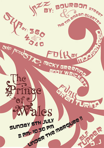
The Prince of Wales is a very traditional pub in terms of its interior, but obviously for an event like this, and in order to stay in profit they would like to attract a young crowd. So I wanted to create something a bit funky to compete with the newer, refurbished, trendier pubs that are in abundance around Moseley, without trying to deny The Prince's unique traditional character.
In order to do this, I took some photographs of some of the lovely patterns inside the pub - wrought iron on the stools, gilt on the mirrors, etc - and traced it into a vector pattern. I took this one from an old piano that sits in the bar.
I tried to match the colours with the pub's interior too - next time however I'll try to take into account print colour (although it's difficult when they're using an inkjet). I thought the typographic nature of the poster would bring it up to date in spite of the wine colour scheme.
The fonts are a nice chunky one I found on my boyfriend's computer, and something that is actually a graffiti/tagging font, which seems to work well. It mirrors some of the shapes in the more sensible font which means it doesn't look out of place, while adding that essential 'young' edge.
I now think that the text is a bit too wimpy and could do with a bit more oomph, to fill up the space a bit more, but I'm quite pleased with it as it was a rather large step for me in terms of using type as form - it was a bit of a 'eureka'! moment.

No comments:
Post a Comment